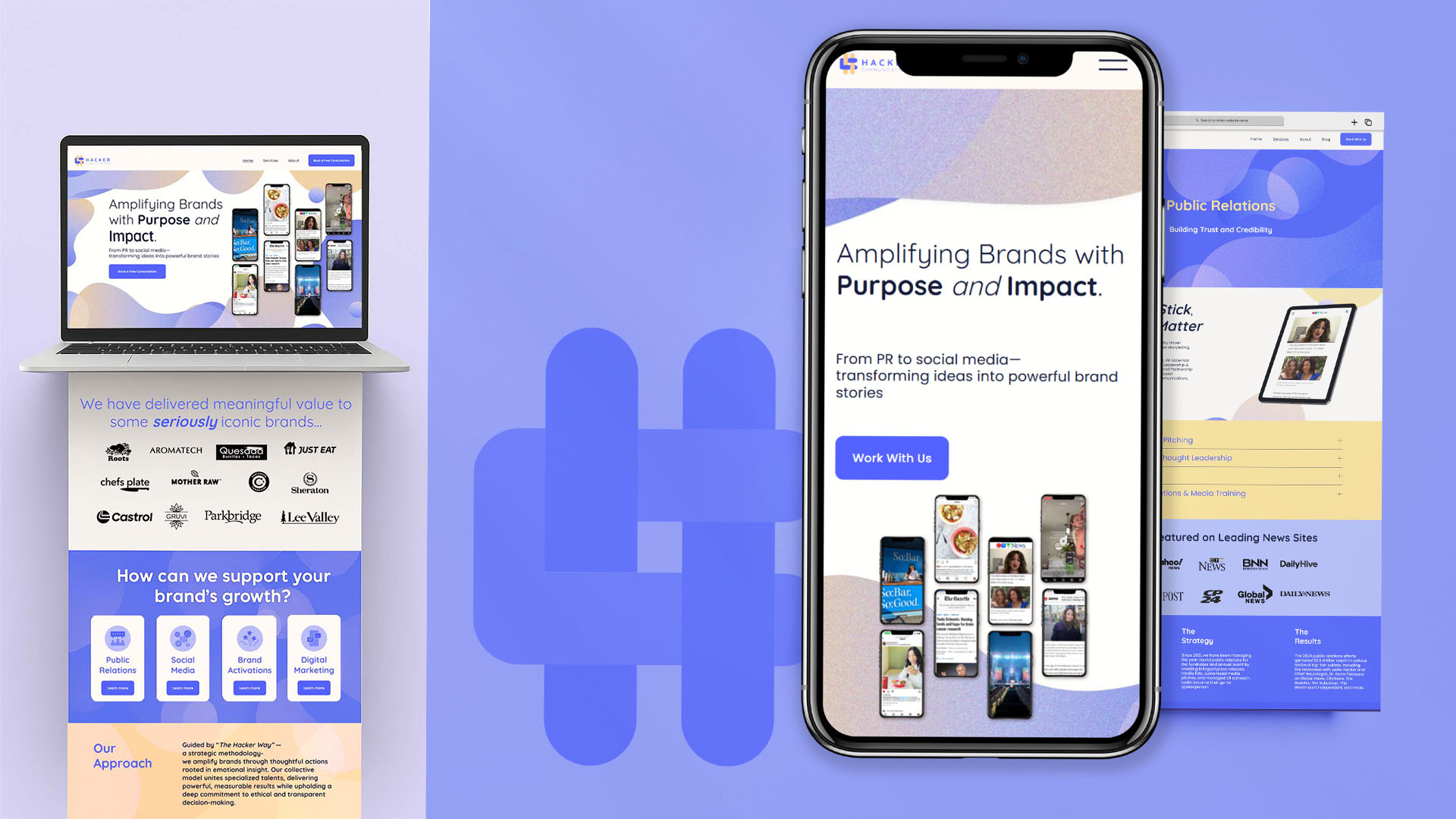
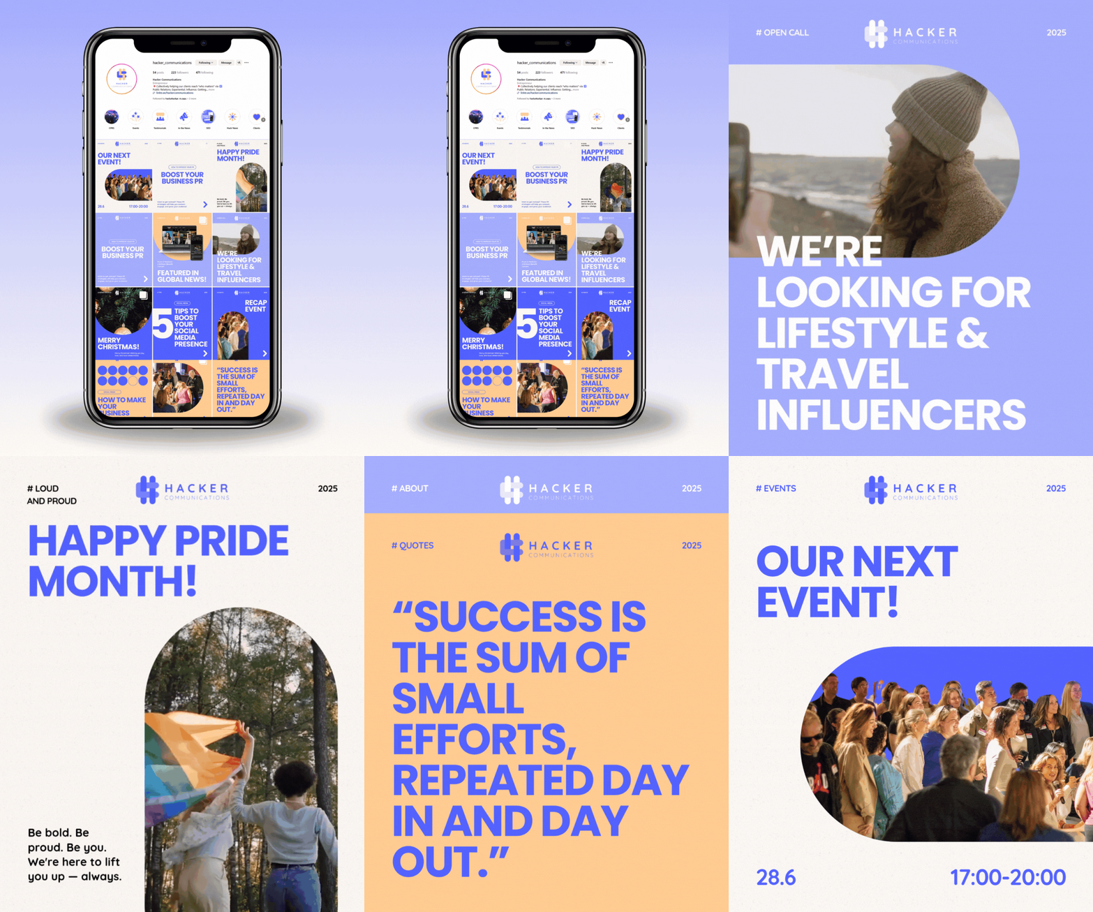
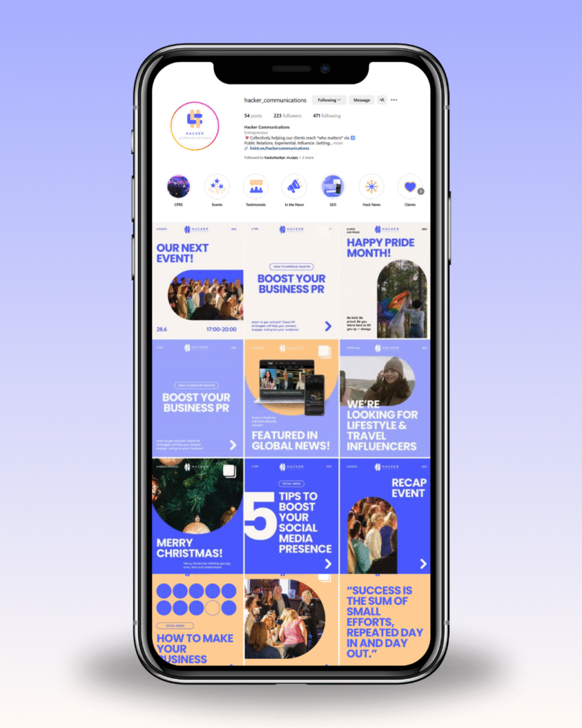
Hacker Communications approached me after rebranding, but their existing website no longer reflected their new identity. The design was outdated, the structure lacked clarity, and the SEO was underperforming. On social media, their visual content felt inconsistent and cluttered.
SOLUTION
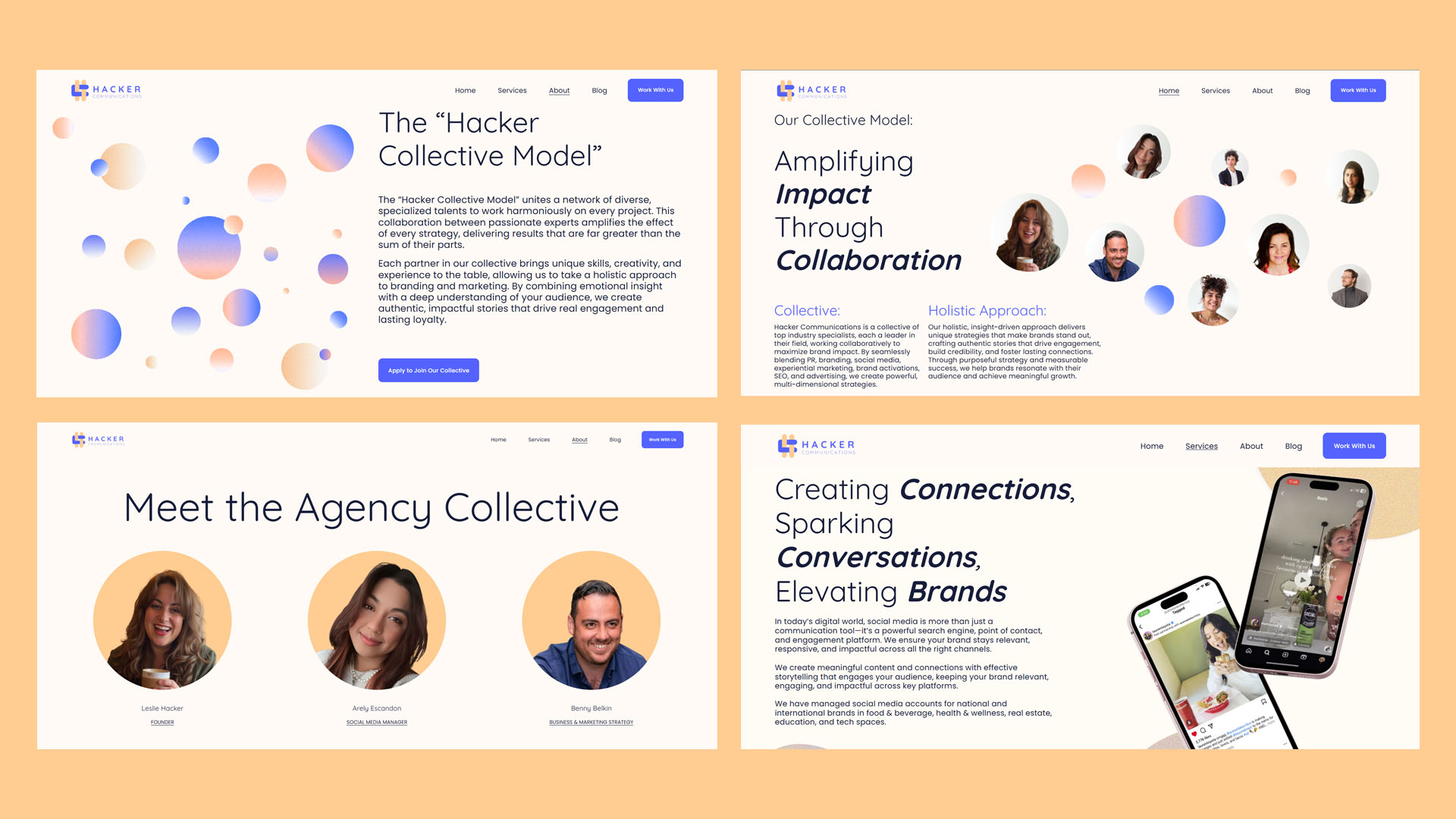
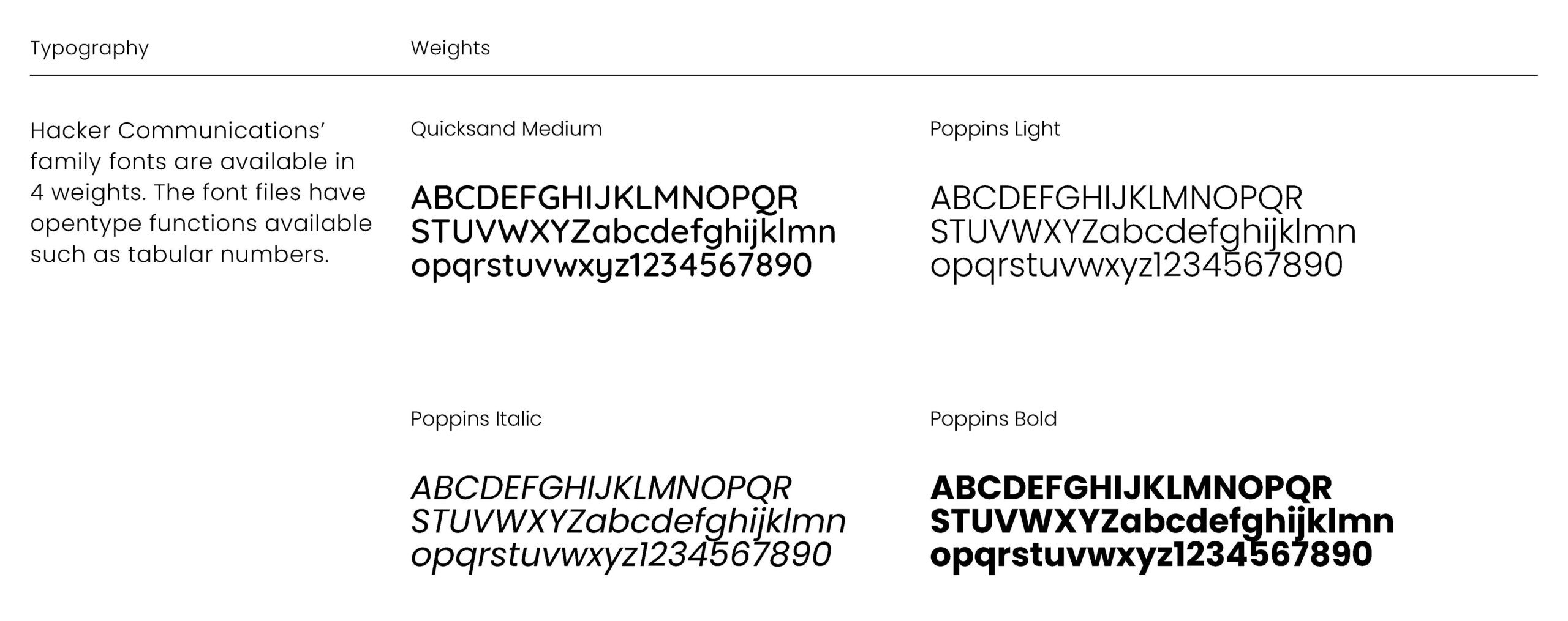
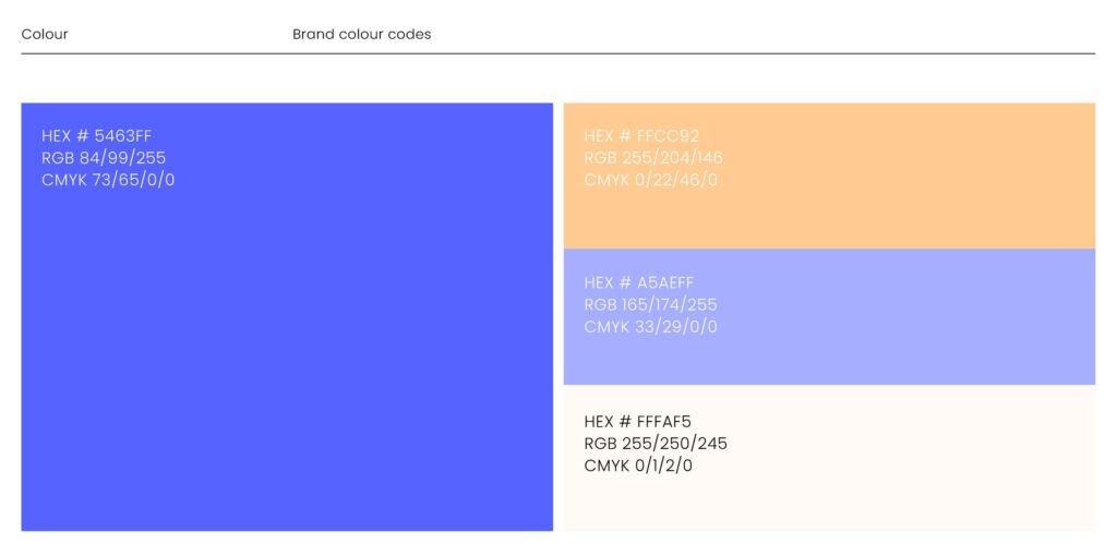
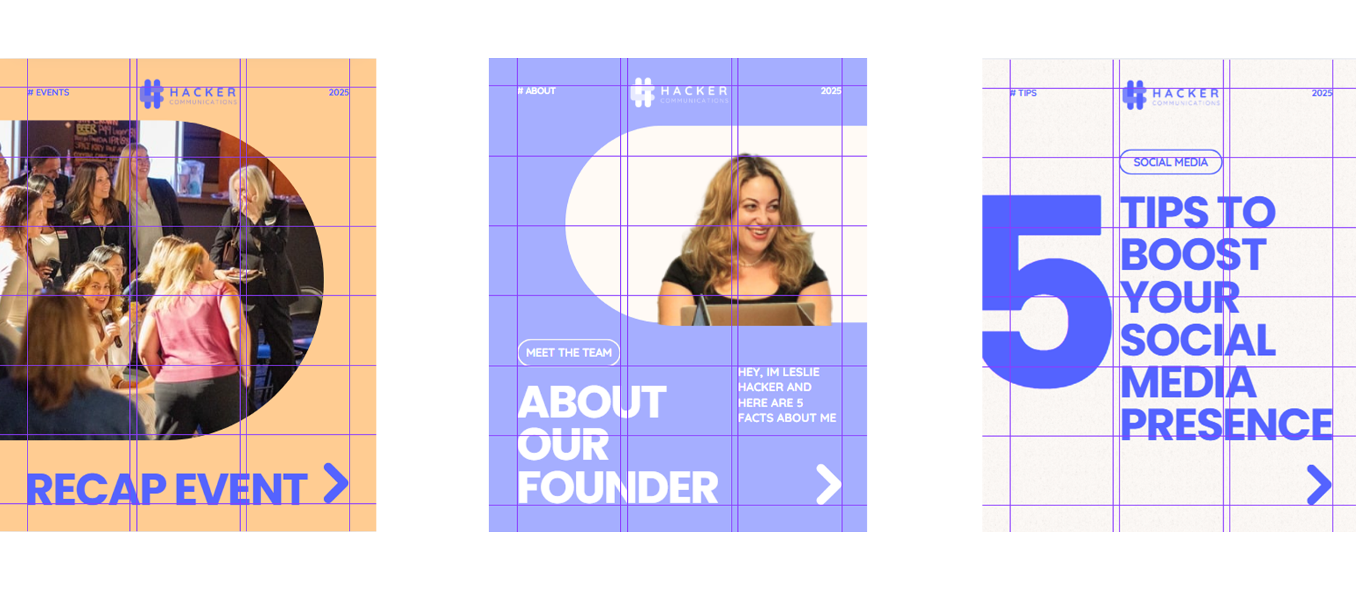
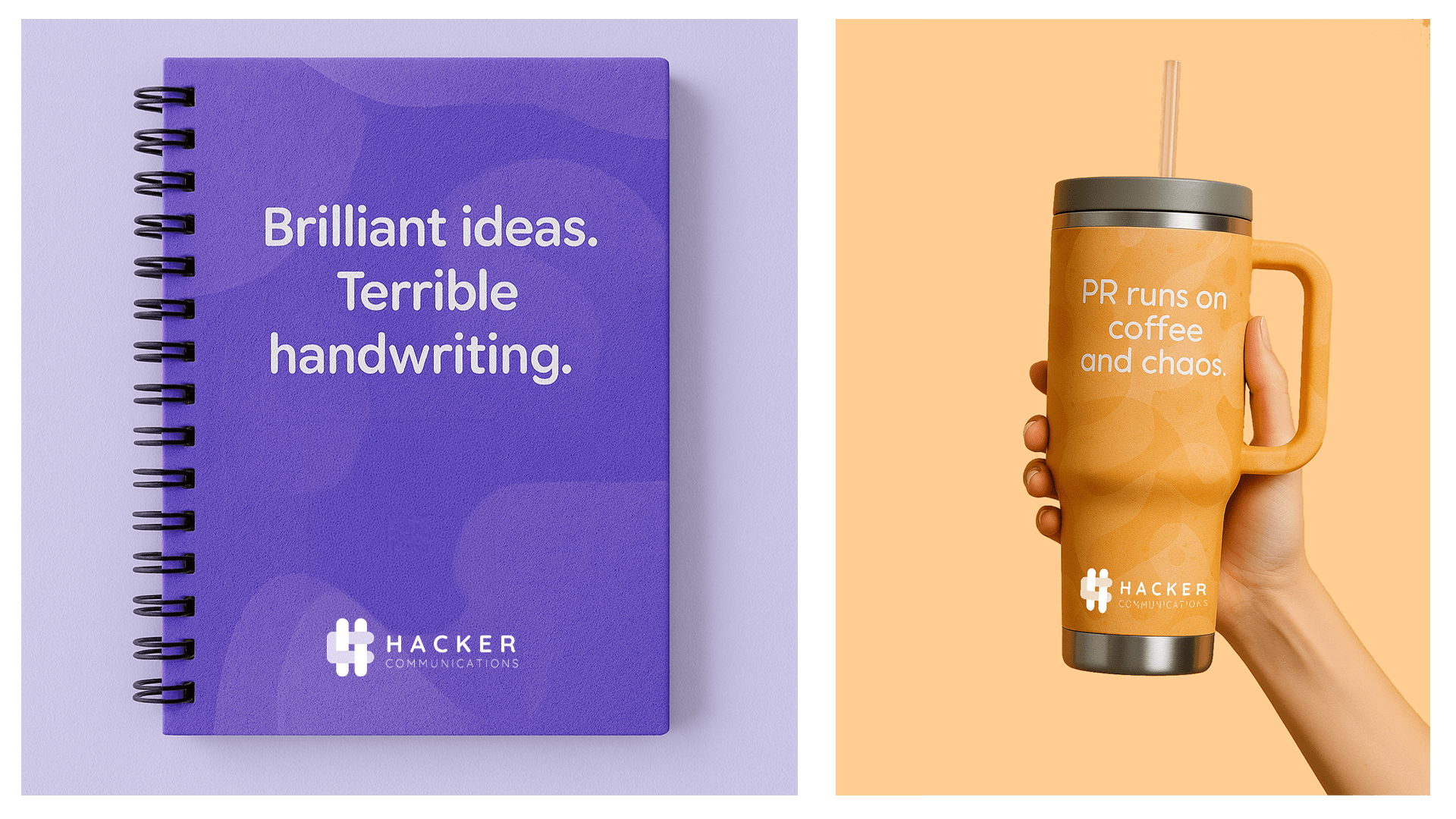
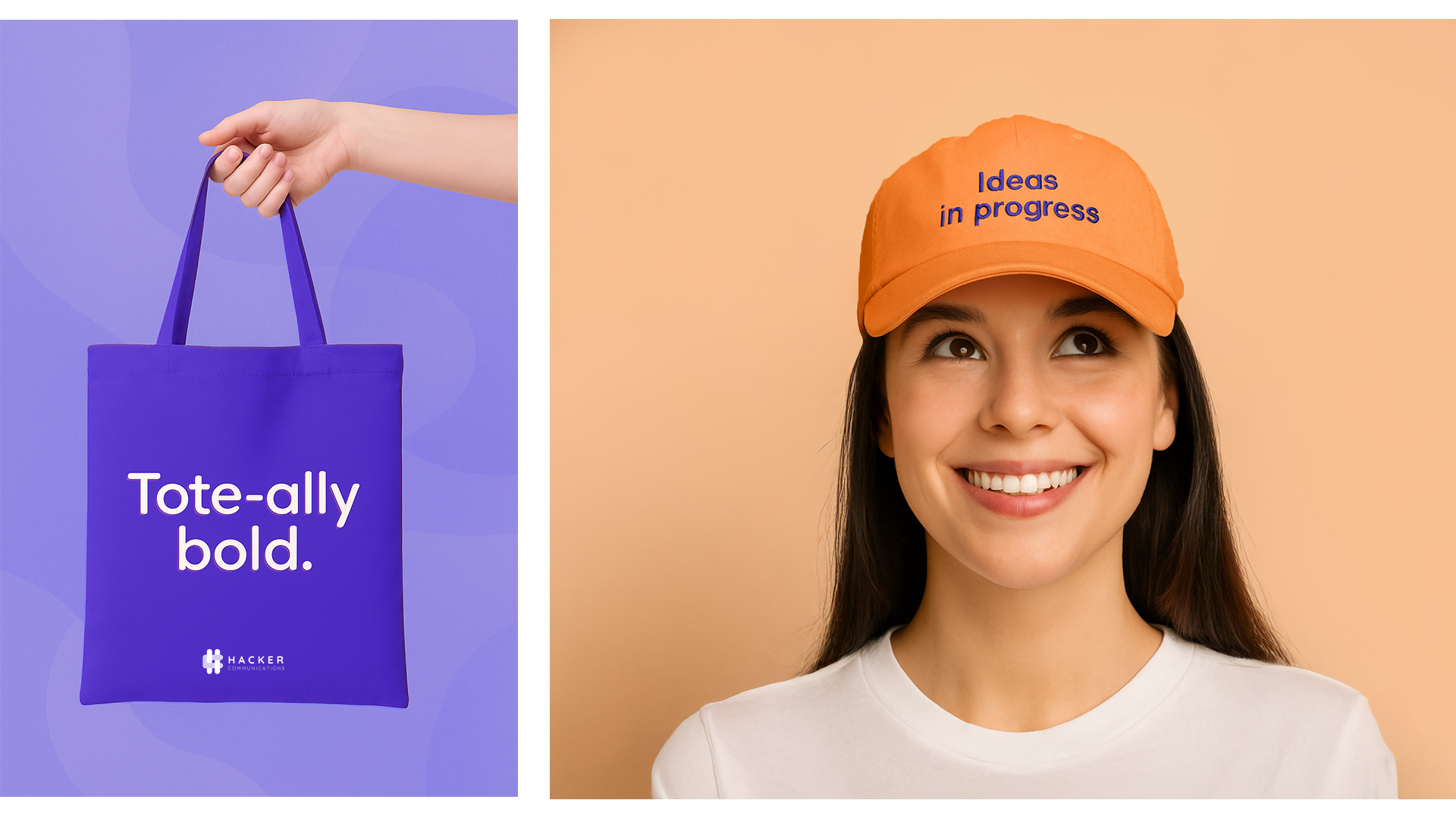
I redesigned their website while staying true to their updated brand language — a visual system built around the idea of a collective: abstract shapes that come together to create something greater. I added new pages to improve structure and SEO performance, and maintained a vibrant, cohesive style throughout. For social media, I introduced a clean, modern grid based on logo-inspired shapes to create a unified and recognizable feed — all while preserving the colorful, playful tone of the brand.