Rebranding of the Haifa Cinematheque in Honor of its 50th Anniversary
PREVIOUS LOGOS
The previous branding of the Cinematheque featured generic typography paired with a burgundy color that felt serious and heavy. I decided to return to the original, first logo of the Cinematheque, focusing on a blend of old and new, combining youthful energy with nostalgia, and introducing a vibrant, bold color.
THE FIRST LOGO
THE NEW LOGO
The Haifa Cinematheque logo connects its cinematic legacy with a bold, youthful spirit. Red evokes the warmth of cinema seats, while rounded multilingual typography mirrors Haifa’s cultural diversity and the art of film.
DESIGN SYSTEM
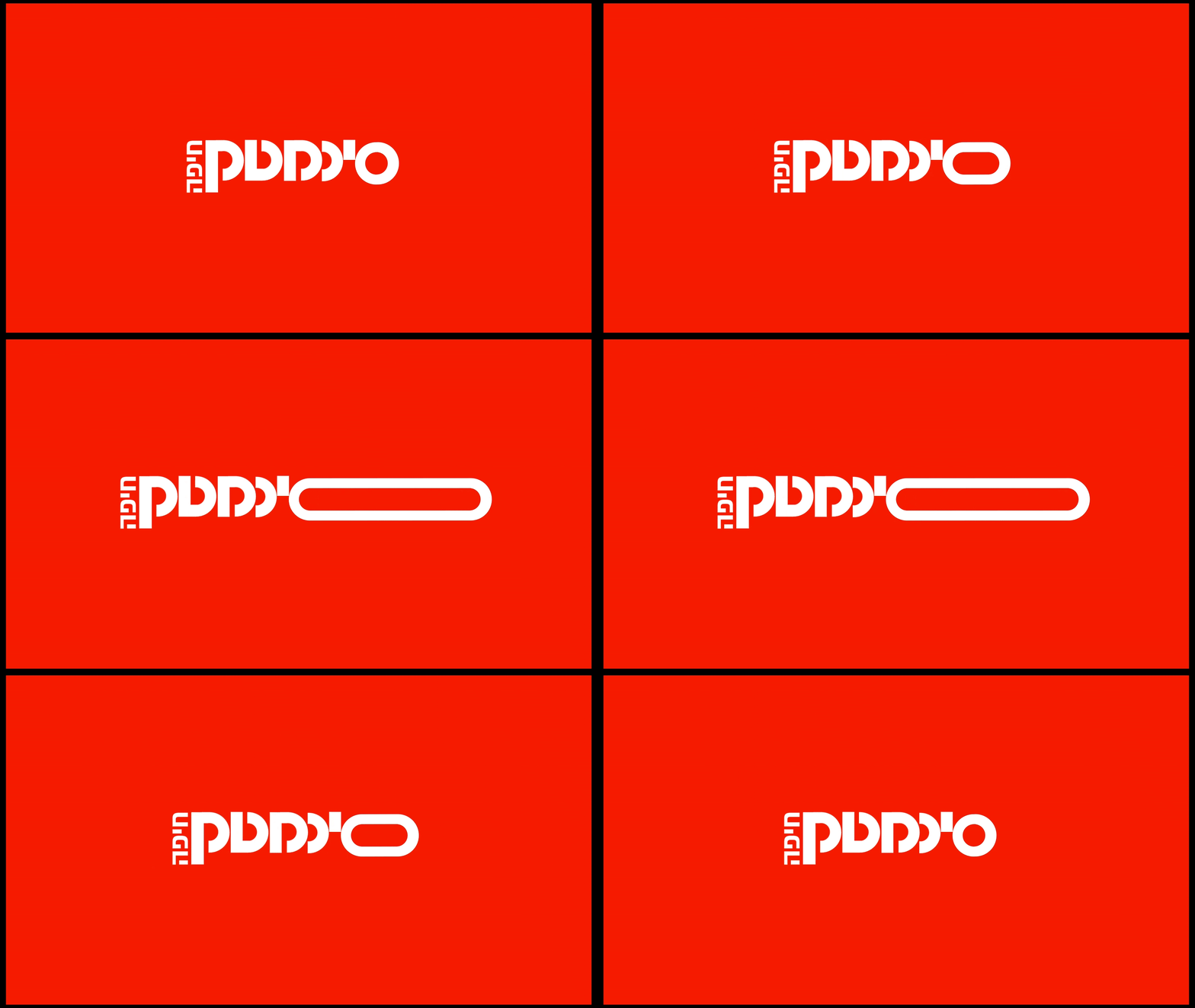
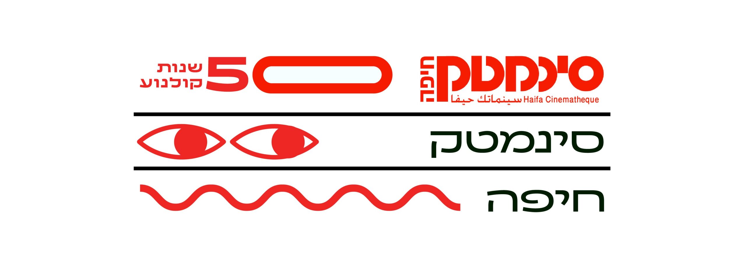
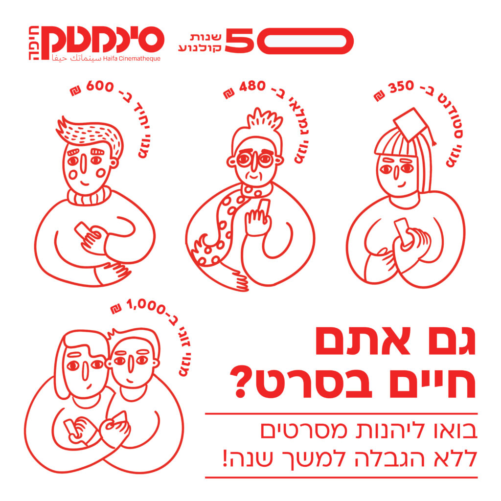
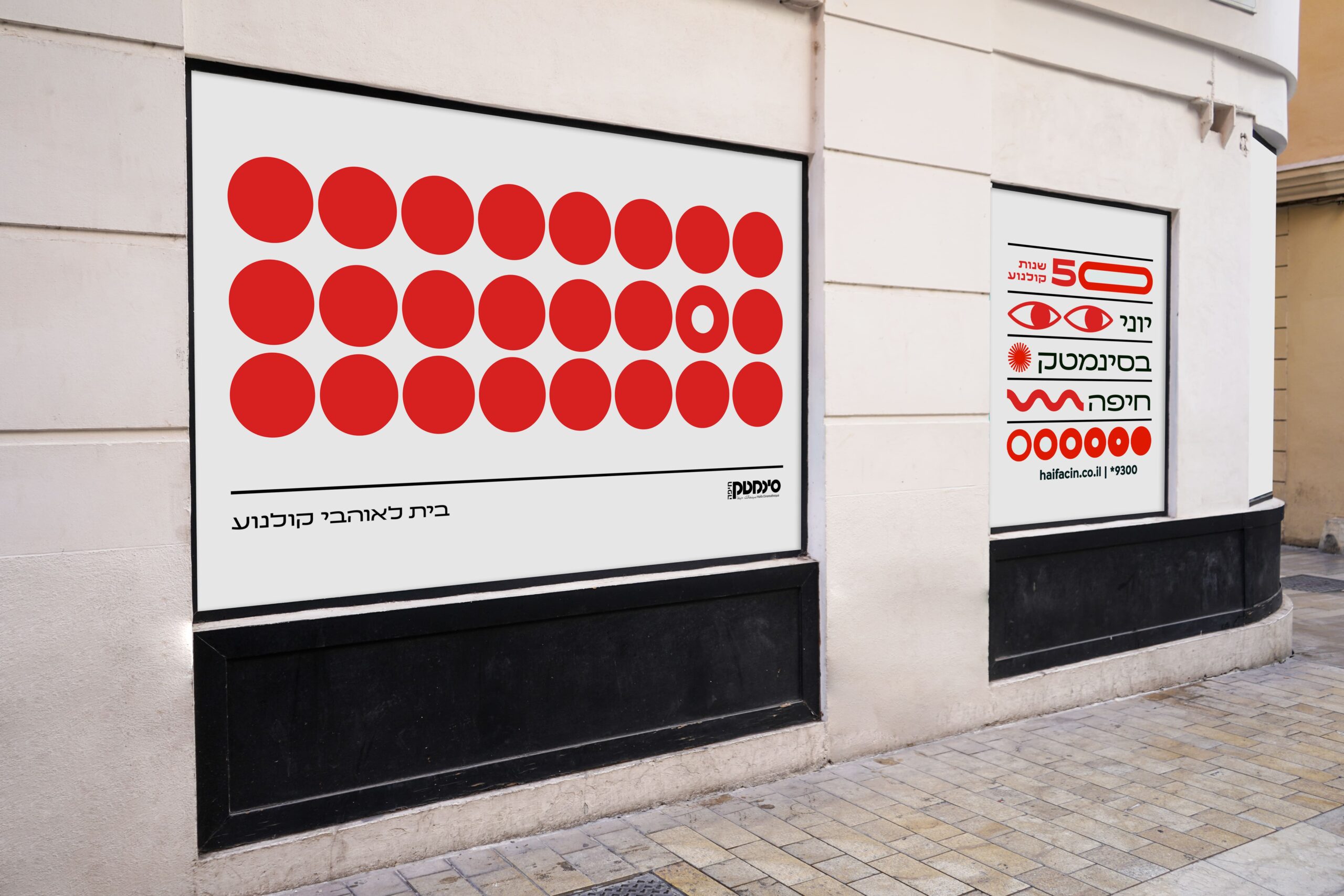
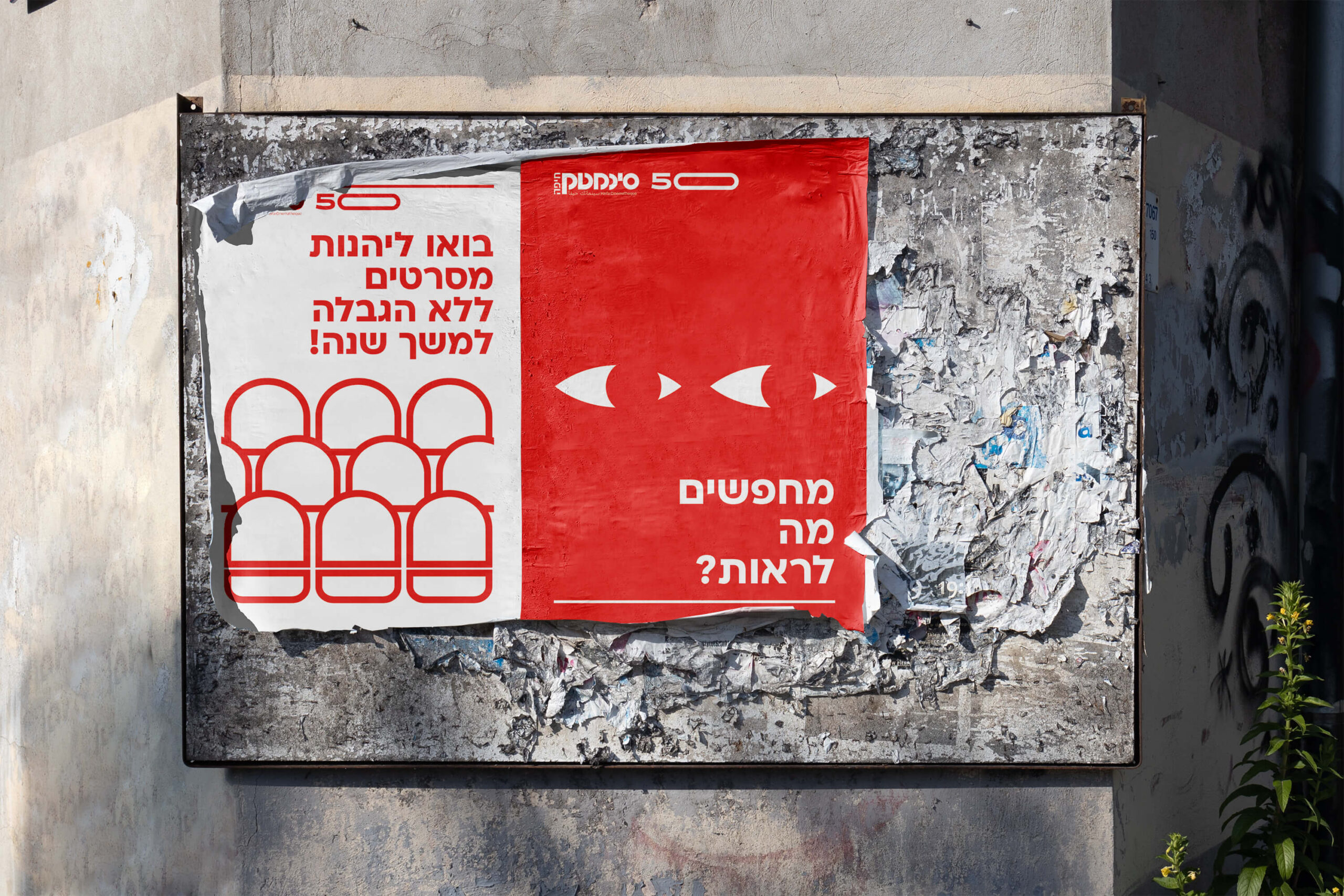
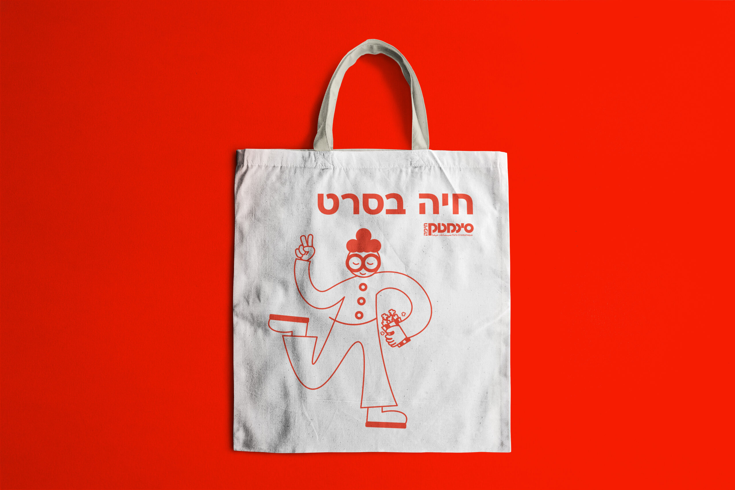
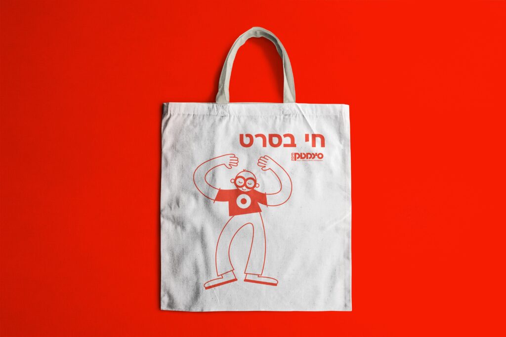
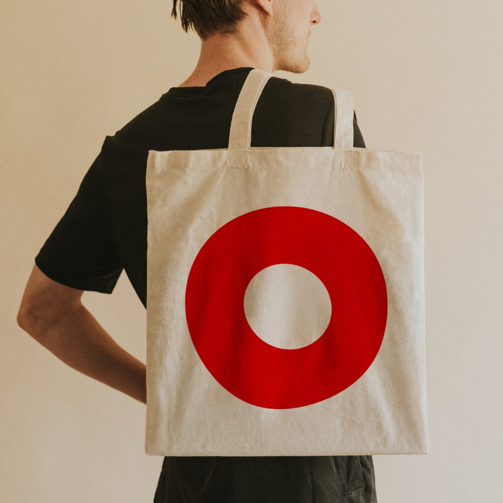
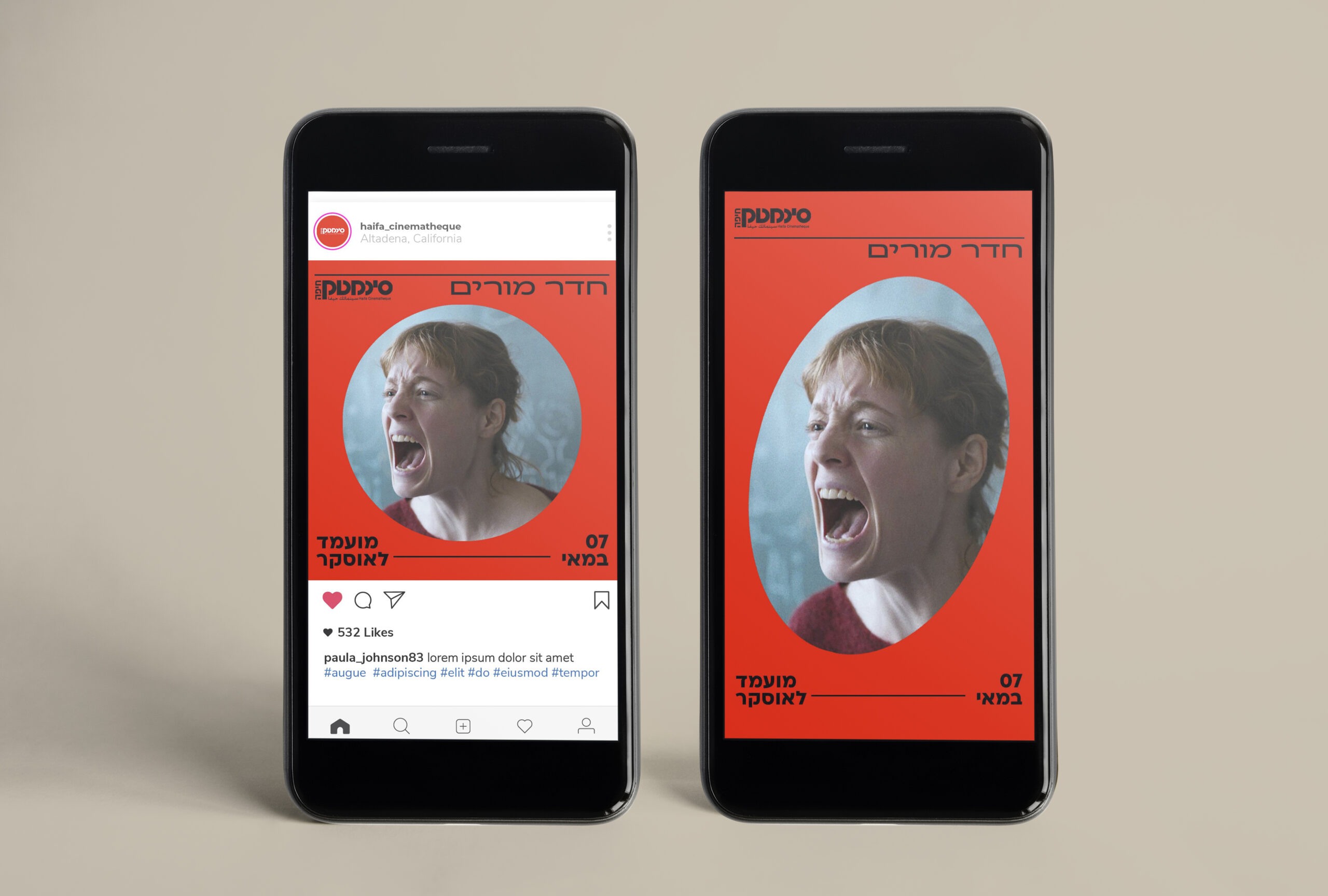
The overall design of the branding is centered around the circular elements of the logo, which are consistently applied across various platforms, including animations and illustrations. This cohesive approach is crafted with the specific goal of appealing to a younger audience.
CHALLENGE
The Haifa Cinematheque is a long-standing institution dedicated to making culture and cinema accessible to the public. In recent years, it has struggled to engage younger audiences. The goal of the rebranding is to create a cool and innovative identity that resonates with the younger demographic while preserving the brand’s core values and rich history.
SOLUTION
Developing a new and distinctive visual language for the brand that aligns with its core values as an institution dedicated to making culture and cinema accessible. The rebranding aims to strengthen the Cinematheque’s position and attract new audiences, particularly younger ones.
IMPACT
Redesigned the visual identity to attract a younger audience (ages 15–30), resulting in a 15% increase in membership purchases among young adults within a year. This effort also enhanced the organization’s social media presence, increasing engagement by 20% and contributing to an overall growth in memberships.