Visual Identity for the 40th Haifa International Film Festival
CHALLENGE
As the Haifa International Film Festival celebrated its 40th anniversary, there was a need to create a visual identity that honors the legacy of the Cinematheque (where the festival is hosted) while also appealing to a younger, more vibrant audience. The branding had to feel festive, approachable, and reflect both the history and the energy of contemporary cinema.
SOLUTION
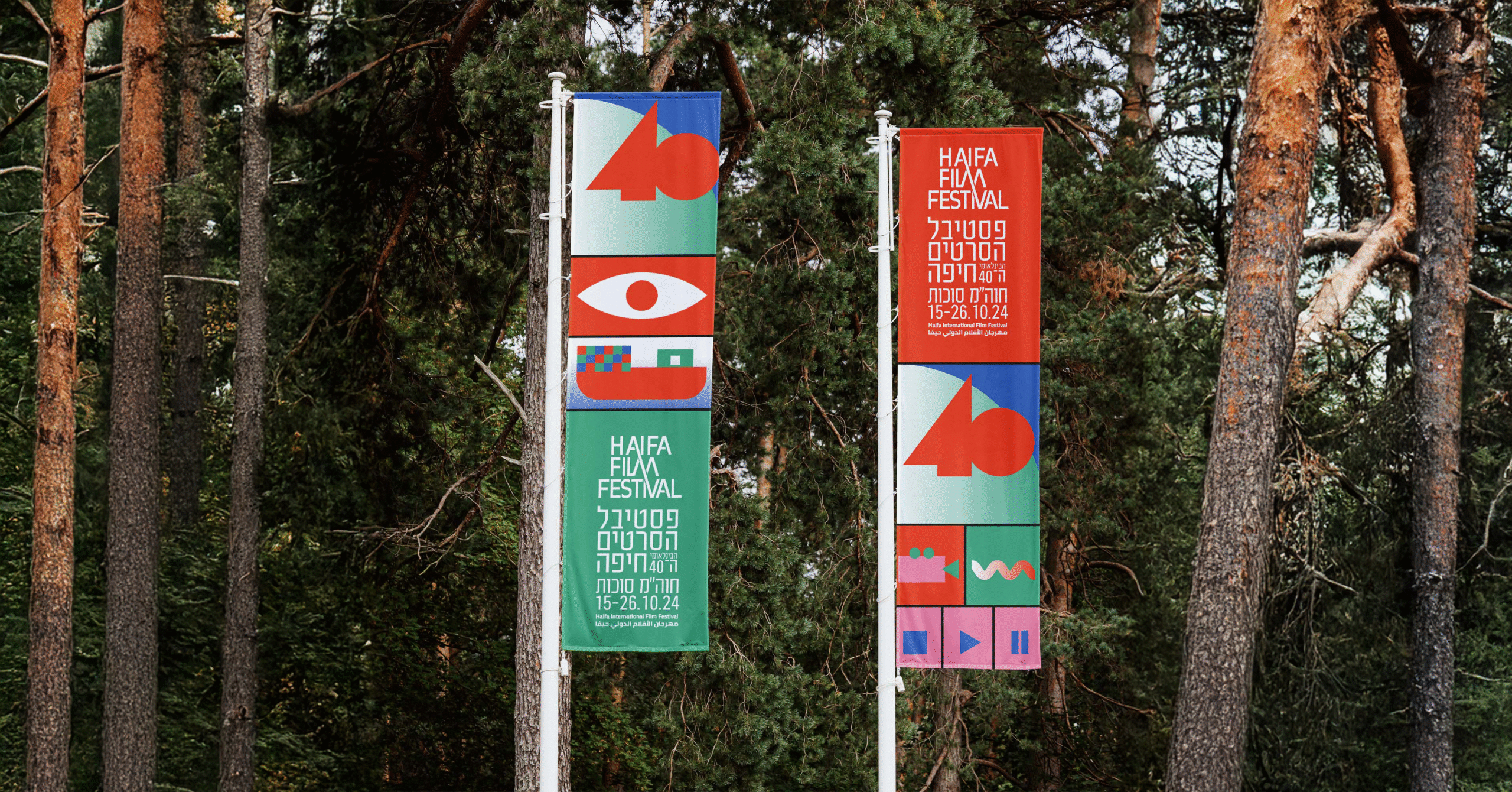
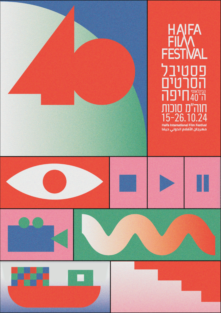
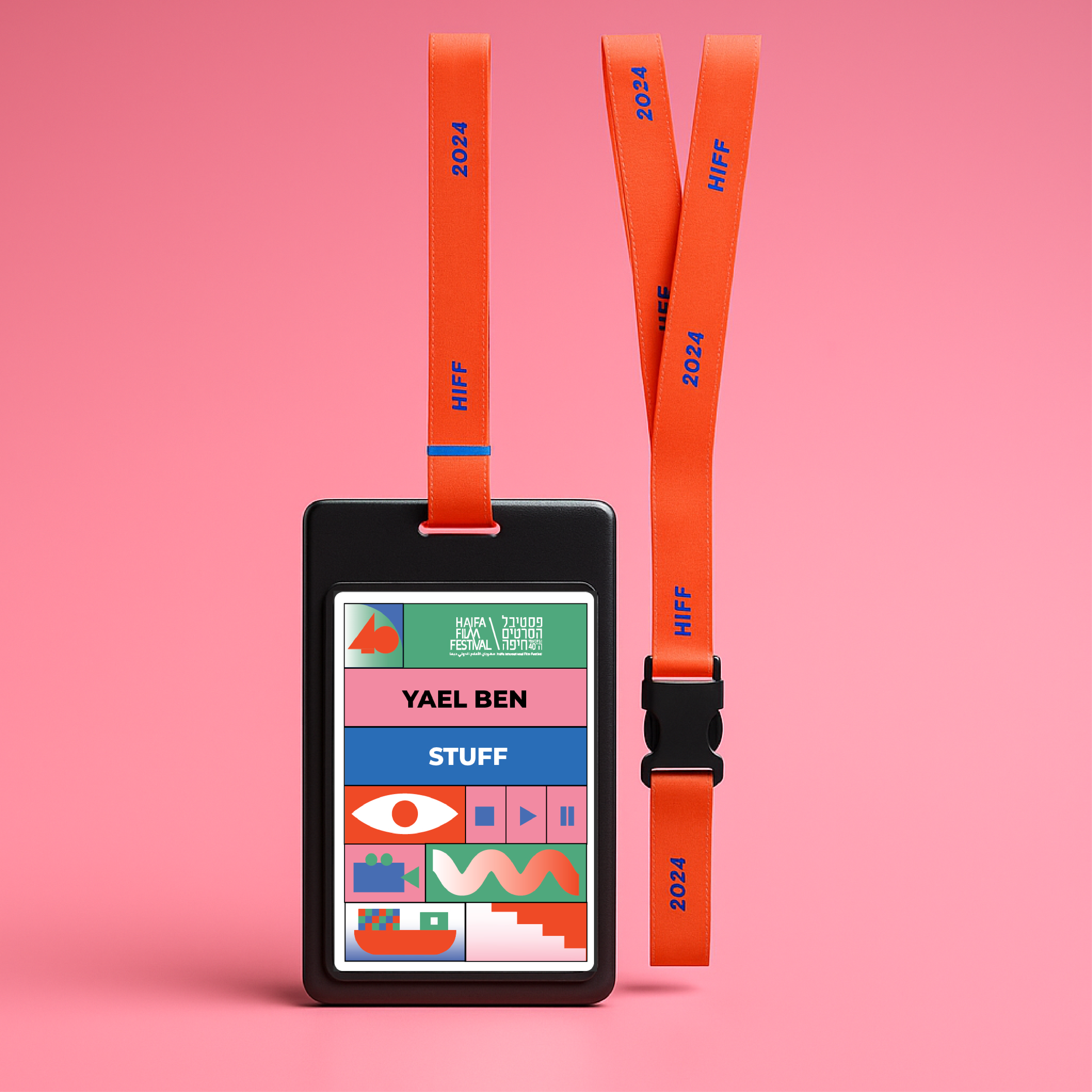
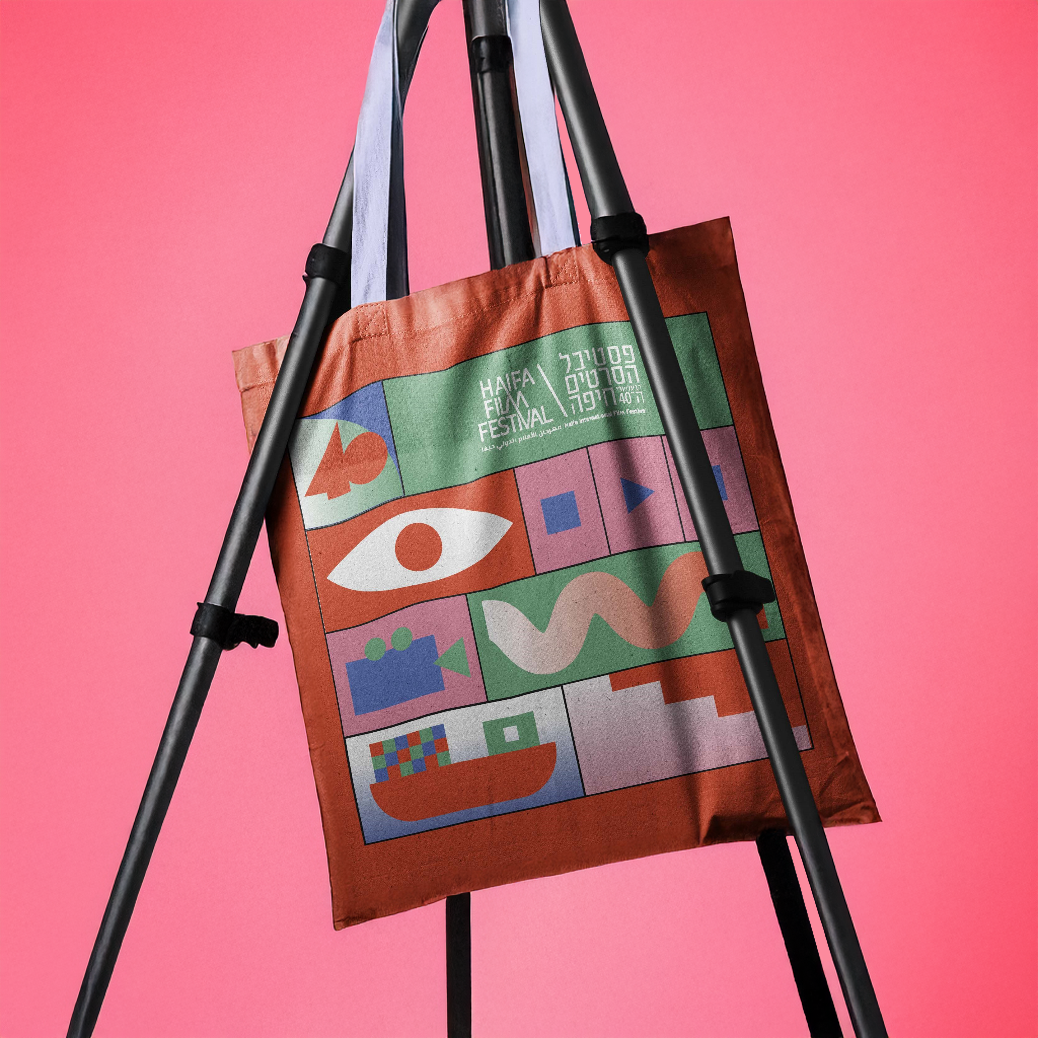
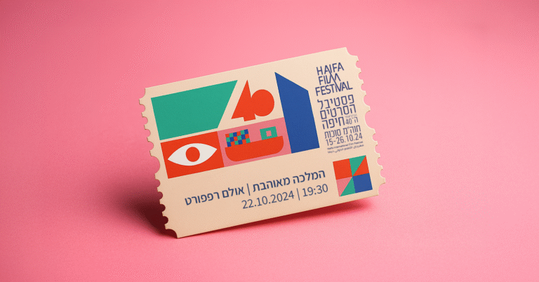
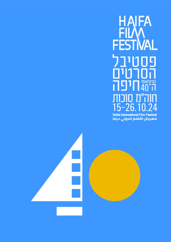
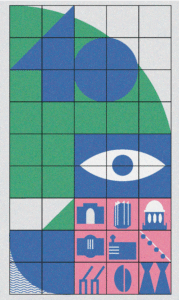
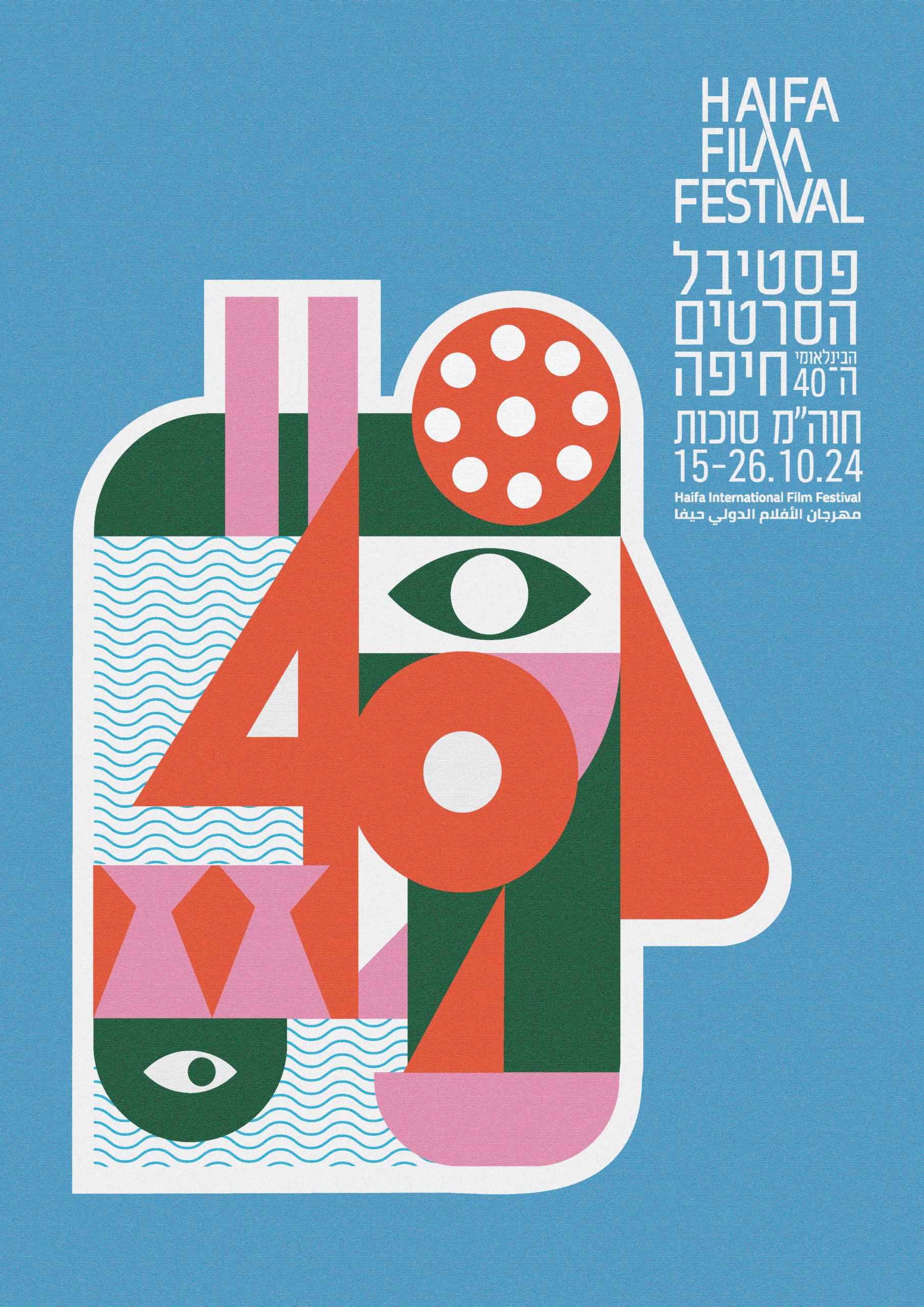
I developed a retro-inspired visual language using a bold and cheerful color palette that draws from the local landscape — the sea, the mountain, and the iconic red of cinema seats — with a touch of playful pink for contrast. The geometric illustrations combine universal playback symbols with visual cues unique to Haifa: the city’s stairs, the mountain’s silhouette, and the ships that bring stories from around the world. The result is a celebratory, youthful identity that bridges tradition and modernity. While this concept was not ultimately selected, it reflects a fully developed visual identity built on deep research and storytelling.